According to literature theorist Hans Robert Jauss, some of the most important works are those that are completely outside the horizon of the expectations of the public, but in the long run contribute decisively in changing this horizon.
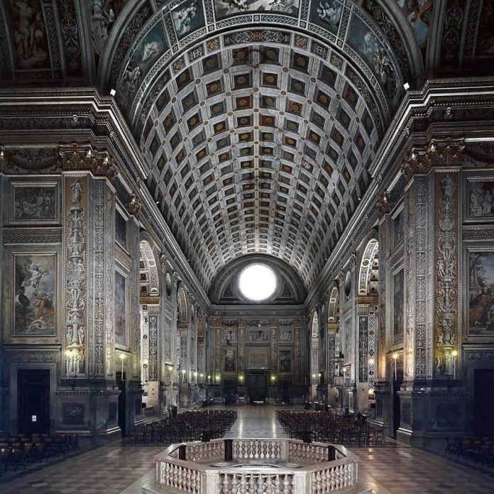
If this also holds for architecture, then few buildings would seem as important as the Basilica of Sant’Andrea in Mantua. In contrast with the Gothic cathedrals, Sant’Andrea did not aspire to give the impression that it was reaching the sky. Neither did it seem, due to its daring static, to be standing by god’s will, nor did its walls evoke lace. It did not have a portal decorated with hundreds of statuettes depicting saints, people, and animals. Sant’Andrea—a huge church one hundred meters in length—was distinguished by its serenity. The overwhelming robustness of its massive piers, the huge barrel-vaults, the Corinthian pilasters, the cornices and coffers—all gave it the majesty of Roman buildings of similar size, many of which were still preserved in rather good condition. A few years later Michelangelo would convert the frigidarium of Diocletian’s thermae in Rome into a church, the Santa Maria degli Angeli; only the painting and the chanting during the mass would have reminded worshippers that this magnificent space was devoted to religion. Sant’Andrea, erected only fifty meters from the medieval town hall, differed most decisively from the buildings that surrounded it, in that its façade was clearly inspired by Roman triumphal arches. The typical Gothic cathedral front, with its one central and two side entrances had been transformed into a statement of intentions for a new architecture anchored in the past.
Although it was a period for admiring the Ancient World and seeking in it the support for a new beginning—a Renaissance—the very idea that a Christian church could unreservedly adopt Roman buildings forms, was if nothing else, original. Half a millennium earlier, the attempted revival of Roman architecture, the Romanesque, remained a world apart from its ideal and soon, in the twelfth century, developed into a clearly distinct direction, leading to Gothic architecture.
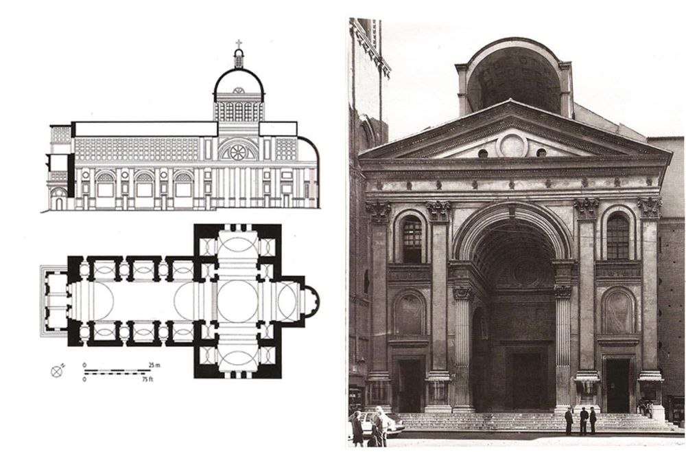
The decades required for Sant’Andrea’s construction—which commenced in 1470—gave the public the time to accept this completely unusual building. As Rem Koolhaas points out, architecture is slow.1 In Sant’Andrea’s case, this might have been a good thing. Architecture is lacking compared with the activities it has to accommodate, not to say it is inconsistent with them in regards of time. When the marble tiers of the theater of Dionysus were constructed in the southern slope of the Acropolis hill at Athens, the major theatrical writers—Aeschylus, Sophocles, Euripides—were already names of the past; their plays were still performed along with the current ones, which were of a much inferior quality by contemporary standards, as well as those of today. If we expect the various arts to be on the same pace, then this marvelous building appeared with a delay of approximately one century.
Leon Batista Alberti was Sant’Andrea’s architect. He was born in Florence in 1404 and among other things he wrote a treatise on painting, De Pictura, and one on architecture, De Re Aedificatoria. Although Alberti’s treatise followed Vitruvius’ De Architectura in its division into ten sections (“books”), one can discern the Renaissance author’s sense of superiority toward his predecessor. This probably derived from the fact that Alberti had more extensive knowledge of ancient Greek and Roman literature than Vitruvius, who was an army officer; Alberti resorted to it at every opportunity to substantiate his arguments. Moreover, Vitruvius seemed to miss the point in identifying the essential features of Roman buildings, because he primarily referred to Hellenistic architecture, which he admired; an architecture that was nevertheless absent in fifteenth-century central and northern Italy. In the Renaissance, ancient Greece existed only in the writings of Aristotle and Plato, Aeschylus and Herodotus, Euclid and Galen. At the time, Athens, Delphi, and Olympia were practically inaccessible to Western architects and scholars. Hence, there was only Rome as far as architecture was concerned.
Alberti offered a full package of theoretical support and practical advice to utilize this great inheritance. The new architecture, though, never stooped to the actual replication of Roman architecture: it was a rather creative, and at times libertine, reproduction of the latter (regularly much more libertine than in the case of Sant’Andrea, whose architect had studied Roman ruins systematically in his youth). The practical spirit of the Middle Ages was still alive, and people built in a way that served them best, ignoring faithful compliance to the original.
On top of that, Alberti himself did not seem to have taken at face value what his predecessor had said. If the symbolism has some significance, his De Re Aedificatoria was the first printed treatise on architecture in the Western world. It was completed probably around 1452—i.e., almost three decades after the discovery of Vitruvius’ De Architectura—and was printed in 1485, a year before Vitruvius’ text, which circulated for decades in manuscript copies.
The aesthetic advocated by Alberti can be summarized by the rule that beauty is achieved when nothing can be added or removed from a building without disturbing the harmony of the whole. This classical principle, formulated with much more elegance than Vitruvius’, condenses the break with the medieval tradition: the latter was a dynamic architecture, permanently incomplete, an architecture balancing between regularity and irregularity. Apart from some later examples, non-religious edifices were usually the result of additive and conjectural design and construction.
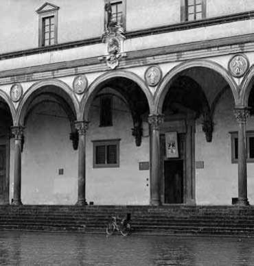
Slowly, during the late Middle Ages, it was recognized that regularity adds prestige—cathedrals may have contributed decisively to this shift—and that in order to attain it, sacrifices in functionality or in the defensive qualities of the buildings had to be made: a window in a position somewhat different from what practicality would have required (in order for it to be in the same level and in the same distance from the rest); a door bigger than necessary (in order to fit aesthetically in the floor’s height), and so on. Loggia dei Lanzi, for example, built between 1376 and 1385 right next to Florence’s town hall to house the assemblies of the citizens and the official ceremonies of the city, was one of the buildings heralding the new era.
With the confidence in regularity established, pioneer architects at the beginning of the fifteenth century were ready to go even farther. Considered as the very first projects of Renaissance architecture, the dome added to the then incomplete Gothic cathedral of Florence and the Ospedale degli Innocenti (i.e., the city’s orphanage)—both works by Filippo Brunelleschi (construction begun in 1418 and 1419 respectively)—inaugurated with their simplicity the new visual culture in Europe’s built environment.
The wear of the Roman ruins’ ornamentation made the purity of their geometry even more clearly visible. In the Ideal City depicted in the paintings of the Palazzo Ducale of Urbino dated in the late fifteenth century and attributed, as we saw in Chapter 10, to the circle of Piero della Francesca, all the buildings are square or circular. But the choice of using elementary geometrical shapes for the outline of the building’s layout was also due to the intellectuals’ fascination with Platonism and NeoPlatonism. This was despite of the fact that the geometry-based Platonic cosmology was unconvincing and particularly incompatible to the Christian worldview.
The circle was considered to be the most perfect shape and thus churches were often given this form or some variations of it. Moreover, the circle brought emphasis to the congregation and this was fully consistent with the humanist spirit of Renaissance. Similarly the “scientific” perspective invented by fifteenth-century painting brought the viewer to a very privileged position by making him the ultimate reference point of the painting—i.e., by structuring the painting in such a way as to give to the viewer the “right” feeling of depth. The small church (tempietto) of Saint Peter built in 1502 on the presumed location of the founder of the Christian Church’s martyrdom in Gianicolo, Rome, has a perfectly circular shape. Eighteen hundred meters to the north, Saint Peter, the most important Western church—built on the location of the original basilica erected by Constantine the Great—was also conceived with a centralized plan by Donato Bramante, who envisioned a huge dome rising above the saint’s tomb. Although the plan was altered many times by the architects who succeeded Bramante, Michelangelo’s final design also made provisions for a centralized church. Eventually, this plan was revised during the CounterReformation, in the early seventeenth century, so that the church would obtain an elongated shape. After the Council of Trent, the balance had tilted decisively in favor of the Latin cross as the appropriate shape for Catholic churches: after all, the faithful had to be reminded (somewhat inelegantly) that the road to salvation is not a short one.

During the European Middle Ages, the world was perceived to be full of signs and symbols, like the night sky is for astrologers. An epidemic was not just an illness, which for some unknown reason was transmitted from person to person, but also a warning from God to a society of sinners. The fall of a meteor was not simply a celestial phenomenon, but an obscure message that had to be deciphered.
Man-made artifacts were similarly perceived primarily as signs. If the Holy Communion bread was the flesh of Christ, the churches represented his body and the crenellations in the town hall of Florence were the symbol of the community’s determination. Of course, symbolism in architecture is not a novelty of the European Middle Ages. In fact due to their additive character, most of the buildings of this period were not particularly appropriate for embodying symbolic meanings. Architecture is a communicative art par excellence and communication is carried out through signs and symbols, which have the capacity to function independently from their physical size. Christians and Muslims respect the crucifix or the Qur’an respectively, regardless of whether they are carved in monumental proportions or printed palm-sized. In architecture, the situation is more complicated because our senses do not allow us to ignore certain fundamental physical aspects of its products; these include size, material, texture, and so on. In good architecture, matter effectively supports the symbolism embodied in buildings; in the case of Egypt, for instance, imperishability was convincingly substantiated with granite. But this was not always the case. Often the total submission of sensory experience to prefabricated ideologies was demanded through the authority of symbols. Architecture had its share of responsibility in such attempts, as in the case of church domes three meters in diameter, in which worshippers had to recognize the heavens.
Renaissance architecture built on the mentality of seeking hidden meanings in things. With a far less mystical approach than that of the Middle Ages, it created a completely new system of signs and symbols that could be applied to buildings. It was a comprehensive language understood by scholars and by the members of at least the upper classes, which remained in use for nearly 400 years (until Romanticism and Classicism took hold in the late eighteenth and early nineteenth centuries, and in some cases even later). Language means standardization in the transmission of meanings, and has the great advantage of not leaving much room for misinterpretations and runaway imagination.
The Greco-Roman columns replaced, among others, the tall, slender medieval towers as symbols of prestige and authority. The hierarchy of the architectural orders was established on the basis of the placement of the columns in the Colosseum of Rome—a building revered through the ages. Its lower band is adorned with Dorian half columns, the band above with Ionian, the next with Corinthian, and the last with composite pilasters. Consequently, during the Renaissance, the Tuscan order was considered inferior compared to the Dorian, and it in turn inferior to the Ionian. The Corinthian was held in higher esteem and the composite one was on the top. The “lesser” orders symbolized nature and wildness and were placed at the building’s lower tier or base, which was often constructed by roughly dressed stones—the so-called ordine rustica. The “higher” orders symbolized culture and civility and were used on the upper floors in the order mentioned above. Artificial caves with allegorical figures adorned the gardens. An especially detailed iconology—pairing images to meanings—was developed based on mythology, ancient history, and the Bible. In a way, it was an extension of the more advanced one used in painting and sculpture.
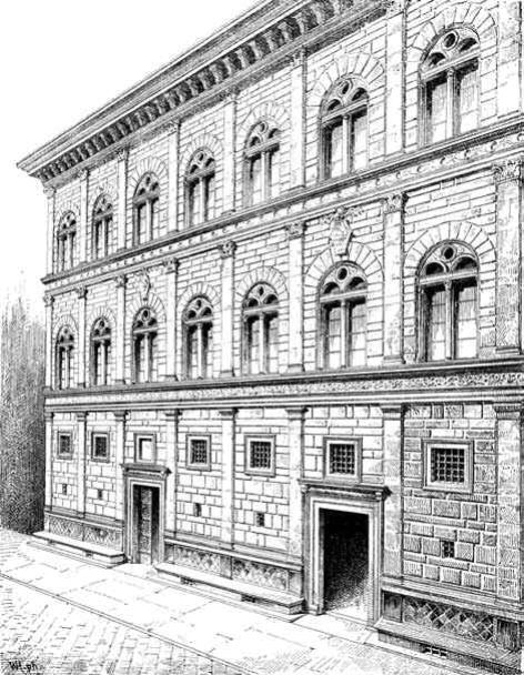
This system of signs and symbols would have been excessively constraining if there was no distinction between those features of the building that gave it appropriate character, and those that gave it variety and grace—decorum and ornamentum, respectively. The modern observer might be slightly confused because the same architectural elements— columns, pediments, moldings—could either be perceived as parts of decorum or ornamentum.
Decorum’s fundamental principle was that buildings should correspond, in terms of layout, size and wealth of decoration, to the purpose of the building and to the social position (and to some extent to the financial background) of its owner. The Tuscan and Dorian orders professed robustness and raw power and were regularly used in rural buildings—and in banks, which later gained their own independent roof. The Corinthian order gave magnificence; it was the Roman order par excellence and thus its use was not “allowed” in auxiliary buildings, such as warehouses and workshops. The first floor of mansions had to have the largest ceiling height and be the most decorated since the owners lived mainly there: it was regarded as the most privileged even in late nineteenth- and early twentieth-century apartment buildings until the popularization of the elevator and privately owned vehicles. It was the piano nobile; the servants lived in the attics. The corner stones had to be dressed more smoothly as one climbed from floor to floor, since this was the world order: the triumph of man—the crown jewel of the creation in Christian faith—over wild nature had to be heralded. The products of civilization were considered superior to naturally grown things; opera di mano had precedence over opera di natura—a belief that remained steadfast in the West until Romanticism. Furthermore, the building as a whole had to be distinguished for its order and balance.
Ornamentum allowed much more freedom, which architects and building proprietors rushed to exploit. The diversity of Renaissance private mansions built in Florence and Rome in a few decades is impressive; they include the Palazzi Pitti, Rucellai, Medici-Riccardi, Strozzi in Florence, and della Canceleria, Farnese, Madama in Rome. Although each of them has a more or less cubic shape with a central arcaded courtyard, the elaboration of their exterior surfaces makes each absolutely unique.
The almost unlimited possibilities of expressing creativity and imagination allowed by ornamentum soon led to experimentations with the norms imposed by decorum. The ruler of Mantua, Federico II Gonzaga, commissioned Giulio Romano in 1524 to design a summer mansion immediately outside the city walls. The Palazzo del Te, as it became known, is a typical villa suburbana of the period, aside from some deliberate deviations from the established rules which make it almost sacrilegious. In the courtyard’s wall, a triglyph of the Dorian frieze seems to have slipped from its place and slid down; a rusticated stone block is situated between smooth blocks; a window stands where it should not be (directly under the slipped triglyph); a keystone of an arch is disproportionally large in relation to the pediment gracing the opening, etc. The paintings that adorn the rooms of the villa, a necessary complement of architecture at that time, were equally “transgressive.”
The so-called Mannerism, where personal “manner” or personal style played a dominant role in the shaping of the buildings, sought its “official” recognition. In 1536, Michelangelo designed the front of the Palazzo dei Conservatori in the Piazza del Campidoglio in Rome, so that “colossal” Corinthian pilasters (extending from the ground to the top of the building) were placed exactly next to the much smaller Ionian columns adorning the ground floor loggia and the windows of the first floor. This layout created a dynamic whole with great inner tension threatening its balance: the pilasters were 2.5 and 3.3 times larger in height than the columns of the ground floor and the first floor respectively, corresponding to sixteen and thirtythree times larger volume respectively. Without fanfare, Michelangelo was testing the boundaries of the rules—the reign of balanced proportions and symmetry—not in a private villa, but in the most formal building complex of Renaissance Rome.
Yet the architects and painters of Late Renaissance were not the only ones who claimed the right to write and rewrite the rules. Critics wanted to have their share as well, defining the ways audiences perceived art—first and foremost, through the use of the term rinascita (Renaissance). It was Giorgo Vasari, painter, architect, and writer of Lives of the Most Eminent Painters, Sculptors and Architects—a book published in 1550 and the first treatise of history of art in the West after antiquity—who popularized the term, which had been already used on various occasions. In the margin of his personal copy of the second edition (published in 1568) of Lives, El Greco noted in a way revealing simultaneously anger and admiration: “the critics are those who do and undo things and thus from this point of view the various judgments of Vasari are true.” Already around 1600, a leading artist acknowledged that the audience had the need for mediation in order to appreciate art, and this mediation was equally an integral part of art, as were the works of art themselves.
An audience trained to accept the unexpected, open to new interpretations and views that were set to constantly overturn its certainties—the creation of this intellectual environment was perhaps the most important contribution of Renaissance to architecture and art. It was an environment that nurtured the radical changes that occurred in the centuries that followed.

