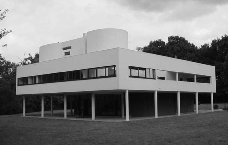
The International Style was the name chosen to describe the modernist architecture of the 1920s and early 30s, when the work of architects such as Mies van der Rohe, Walter Gropius and Le Corbusier was exhibited in New York in 1932. Their architecture of free planning and their aesthetic of functionalism became highly influential and seemed to sum up the ideals of modern architects in the decades before and after the Second World War.
By the end of the 1920s the most adventurous architects had evolved a way of building that became symbolic of what was progressive and new in 20th-century design. Modern communications meant that this way of building was international—buildings in California could look similar to those in Europe or Australia. It is not surprising that this architecture became known as the International Style.
The MoMA exhibition
The most famous early use of the term “International Style” was in 1932, when the writer Henry-Russell Hitchcock and architect Philip Johnson curated the International Exhibition of Modern Architecture at New York’s Museum of Modern Art (MoMA). The book they produced to accompany the exhibition was called The International Style.
Hitchcock and Johnson’s exhibition contained many of the key buildings of the 1920s: villas in France designed by Le Corbusier, the German Bauhaus designed by Walter Gropius, houses in Holland by J.J.P. Oud and buildings by Erich Mendelsohn and Mies van der Rohe. In some ways these structures were very diverse—Oud’s workers’ houses, for example, looked very different from a large department store by Mendelsohn. But seen together, several key features emerged.
Five points of a new architecture
Le Corbusier outlined five key points that were characteristic of the new architecture as he saw it, exemplified in his Villa Savoye (below).
- Raising the building on pilotis, so that the main structure seems to “float” above the ground.
- The provision of a roof garden.
- The “free plan.” In a free plan, and with the structure held up by the pilotis, rooms and interior spaces could be arranged as function dictated, without the need to include structural walls.
- The “free façade.” With rooms arranged at will, the façade could take whatever form function dictated. Walls did not need to be structural because the pilotis carried the weight of floors and roof.
- The use of strip windows to admit plenty of light.

Features of the style
Key features included the use of concrete, steel and glass, the rejection of ornament, asymmetry and truth to materials. International Style buildings also tended to show an interest in volume rather than mass. In other words, in rejecting thick, load-bearing walls the buildings felt light and transparent, and a far cry from the massive qualities of a castle or an Arts and Crafts house. But the volumes, the spaces inside the building, were meticulously worked out and artfully defined by partition walls, screens and windows.
This quality of lightness and transparency was especially powerful. Architects exploited the way in which steel and concrete structures could be held above the ground on pillars (or “pilotis” as they became known), and the way in which cantilevered structures could make upper stories seem to float in space. Generous windows enhanced this effect of lightness, too.
These buildings could also be international in another way. Architects such as Walter Gropius were keen to embrace the possibilities of machine-made components. At the Bauhaus (see Bauhaus), students learned to make high-quality designs that could be mass produced. Factory-made components of a building, from girders to door handles, could be reproduced in any place where the right production facilities existed, so buildings were no longer tied to local traditions, materials and construction techniques.
“… architecture is a social art related to the life of the people it serves, not an academic exercise in applied ornament.” J.M. Richards, An Introduction to Modern Architecture
Functionalism
Modernist architecture was wedded to the notion that “form follows function,” so architects were encouraged to work “outward” from the specific requirements of a building’s users, creating the spaces that would best meet these needs. The exterior appearance of the building—its shape, the arrangement of the façades and so on—would follow on from this, which is why modernist buildings are often asymmetrical.
Planning on a grid
When working according to the “five points,” architects laid out the pilotis at regular intervals, to form a structural grid. This was just one example of grid planning, a system that was used widely by 20th-century architects. This type of planning could be a structural device—a way of enabling builders to use standard components, such as wall panels of the same size—or simply a discipline to create an ordered plan. Grid planning was frequently used for industrial buildings so that concrete frameworks and similar items could be made to standard sizes and building became a task of assembling components.
However, architects of the caliber of Le Corbusier and Mies van der Rohe were highly
visually aware, and sought to make the exteriors of their buildings carefully composed
and balanced, even when they were not symmetrical. This fact gives many modernist
buildings, such as Le Corbusier’s villas, a studied elegance.
An attractive package
By ignoring styles such as expressionism (see Expressionism)
and the works of major individual (and individualist) architects, such as Frank Lloyd
Wright, Hitchcock and Johnson defined a style of modern architecture. It was an
attractive package and, because it included the work of architects of renown, it inspired
many followers. The fact that its ideas could be wrapped in pithy, memorable phrases—
such as “form follows function” and Le Corbusier’s “a house is a machine for living
in”—made it accessible and easy to publicize, too. As a result, the International Style
was influential in the 1930s and remained so after the Second World War.