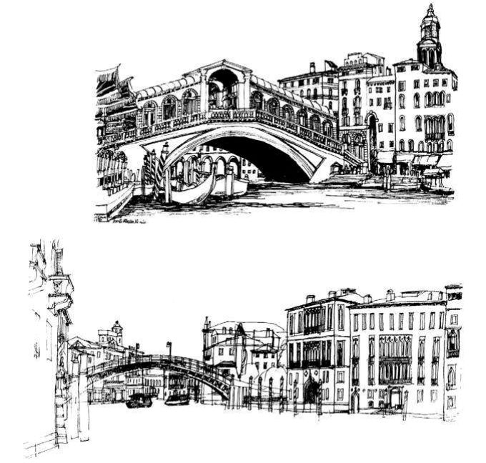
Sketching is about exploration, about learning to see places and architecture through the graphic experience. As such, the architectural illustrator is concerned with interpretation rather than mere description, and that interpretation must contain elements of critical judgement. A common mistake is to draw too literally and to seek representation from one viewpoint alone.
To reach a real understanding of ‘place’, you need to walk through it, thereby experiencing the changing geometries of the urban scene. Sketching can be a useful aid to urban analysis as long as the viewpoints are chosen with some thought. The most rewarding urban spaces often revolve around a public monument where a mixture of squares, streets and lanes provide a range of spatial patterns. As you move through the different volumes, you become aware of large and small spaces, enclosed and partially enclosed ones, connected and unconnected ones. The beauty of many towns, particularly historic ones, lies in this variety and in the unexpected delights that unfold.
You can attempt to record such experiences through a single sketch, but usually a collection of sketches is more informative. The mystery of old towns, which derives in no small part from the irregular street layout, and the marvellous contrast between large public buildings and small domestic ones, can be captured in a well-planned sequence of analytical sketches. The complexity of such places and the subtle interplay between the parts means that three or four sketches are required to capture the essence of the place and its changing geometries. Such sequential sketches (or ‘serial vision’, as Gordon Cullen put it) should be based upon well-selected viewpoints.
For the drawing of a historic town with a major public monument as focus you should sketch:
- the approach from afar, or at least just outside the immediate sphere of influence of the monument;
- a view glimpsed of the monument above roof tops or along streets (the monument should not yet be fully in view);
- a view showing much or all of the monument within its setting;
- a close-up view of the monument, with steps, railings and human activity round about.

Whatever sequence you follow (and many different vistas are normally available), it is important to keep the feeling of mystery and suspense alive. Therefore the story should unfold like a good play, with each drawing an act that develops a particular theme. It often helps if the views selected are of, or appear alongside, ‘hinge’ buildings that act as key ‘events’ in the unfolding of the urban experience. Gateways provide an obvious example, but often steps or a café are equally useful to aid the observer. Few major towns are without such a sequence of spaces and key buildings, and to search them out through the sketchbook is a valuable and enjoyable experience. Sadly many modern places are without these qualities and the designer’s challenge today is how to introduce greater spatial variety into an otherwise dull network of streets.
If you are seeking to analyse urban space through such means, you may find sketch plans useful. They can help relate your sketches to key factors in the structure of the town, and explain dynamic or spatial relationships that were only hinted at in the street view.
By using sequential sketches to analyse urban scenes, you will quickly become aware of the complex geometries present. Slight deviations in routes or changes in level can in reality be quite marked, though they seem hardly discernable in plan or section. Likewise, abrupt changes of direction can break the line of continuity that is so important in the enjoyment of place. Contrast can be employed deliberately and should be reserved for siting significant public buildings such as the sudden termination of a vista by a town hall or the set- back on a street to reveal a church. Often, however, the use of contrast is abused by private buildings such as a supermarket or an office block seeking to draw attention to itself.