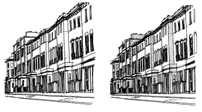
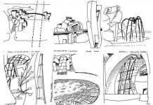
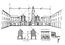
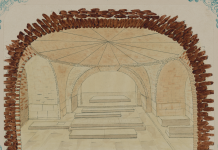
Sketching the outline of objects can lead to rather featureless and abstract drawing. Although one may recognise the shape of a house, its value to us as an object is determined by issues of form, texture and arrangement. These qualities are best represented not by line alone, but through line and shade.
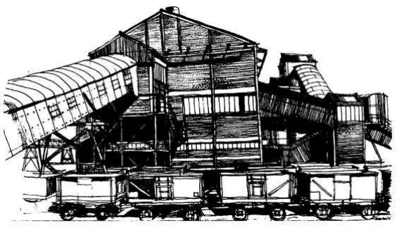
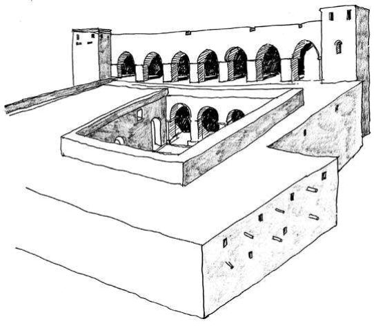
Shade gives a sense of three-dimensional reality to two-dimensional shapes. The convention is simple: select a direction for a source of light (often imagined) and shade the sides of the object pointing away from the light source, drawing the shadow cast on to the ground and other surfaces. Your simple outline will then become alive with form, structure and surface richness. The more the building or object is modelled in plan or section, the greater will be the complexity of shade and shadows.
This convention becomes a reality when you draw on sunny days (mornings or afternoons are the best times to take advantage of angled light), but you can invent a source of strong light if it is not present. Ideally choose sunlight coming over your shoulder (preferably your left one) at an angle of 45°. This will make the dullest power station or comprehensive school suddenly dance off the page.
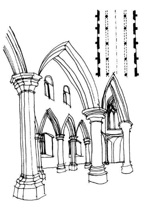
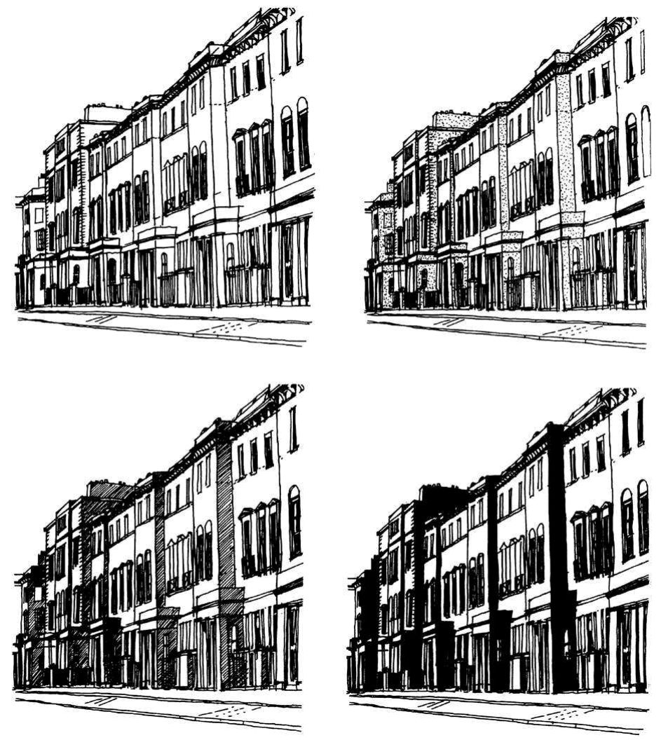
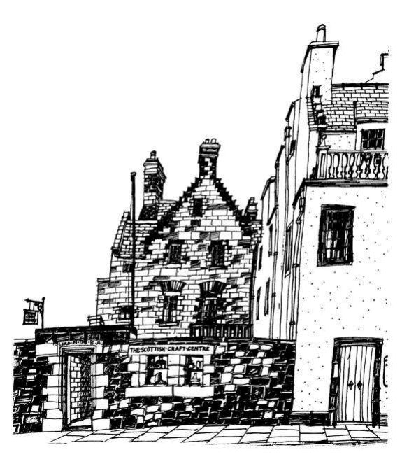
Many eighteenth- or nineteenth-century buildings employ cornices, string courses and window margins in order to create panels of walls and frames to highlight key architectural elements. The presence of these features can be emphasised in the sketch by exaggerating the play of light and shade on the façade. Similarly, modern buildings with their exposed structure and service runs also benefit from the use of this graphic technique. When drawing urban space or landscape design, shade and shadows create a necessary sense of substance to things such as dwarf walls, hedges, trees and sculpture.
By placing elements in front of each other, shadows can be cast from one object on to another. The layering of objects in the picture not only enlivens the composition, but adds spatial complexity to the subject. Elements placed in front of a building such as lamp-posts, telephone boxes or trees give a sense of depth to the sketch and allow shadows to pass along the horizontal surfaces and up the vertical ones. By such means the distances in plan between object and observer can be expressed and exploited graphically.
The function of shadows is, therefore, to make you aware of the depth within the view: they give flat two-dimensional subjects a semblance of reality. The rendition of shadows follows similar conventions to those of perspective. As a rule, darker shade and stronger shadows should be in the foreground of the sketch, becoming progressively lighter as they move into the distance. This has the effect of reinforcing the illusion of perspective.
