Postmodernism is the term used to describe the brash, diverse, witty and colorful architecture that emerged in the late 1960s as a reaction to the simple, restrained architecture of the modern movement. The postmodernists saw their new way of thinking about buildings as stimulating and liberating, and their irreverent approach has had a lasting influence, even on architects who followed other paths.
In the years after the Second World War modernism dominated the world of architecture. Architects valued modernism because it gave them a rigorous way of thinking about architecture—assess the function of your building, design it logically and its form will emerge naturally. Glass-and-steel towers, concrete apartment blocks and similar buildings were the result of this functionalist approach.
Restoring the missing ingredients
But some architects were unhappy with the way modernism cut itself off from many traditional aspects of their art. The modernists looked down on ornament, cut themselves off from the past and produced serious buildings that lacked any dimension of wit or humor. What would happen if these ingredients were put back into architecture? One answer was provided by the architects who rebelled against functionalism to create the architectural style that was later dubbed postmodernism.
The movement began in North America and at its forefront was the architect Robert Venturi, whose book Complexity and Contradiction in Architecture appeared in 1966. In it, he argued for a more ambiguous, paradoxical approach as opposed to the simplicity of modernist architecture. It was a theme he pursued in another book, Learning from Las Vegas, which he co-wrote with his fellow architects Denise Scott-Brown (who was also his wife) and Steven Izenour. The authors praised the eclectic, commercial and brash in American architecture.
Allusion
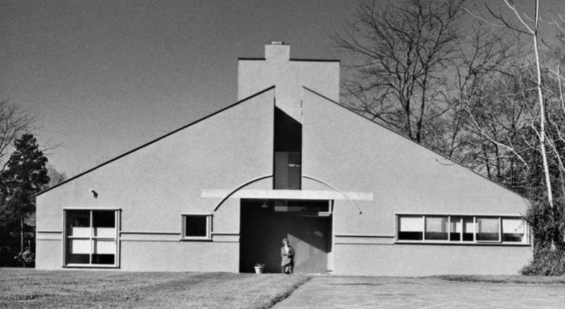
When he designed a house for his mother (below), Robert Venturi said that the front was meant to evoke a picture of a house, especially one from the 18th century. The arch above the doorway is one 18th-century allusion; the way that the gable suggests a triangular classical pediment is another; the horizontal molding, like a string course on an older building, is a third. But all of these features are only hinted at: the “pediment” is split at the apex by a large opening; the “arch” is interrupted by the gap and the lintel over the doorway. Even this is not the whole story—the house also contains allusions (such as the strip windows) to buildings by modernist guru Le Corbusier. The postmodernists liked to have things both ways.
Humor and architecture
At the same time Venturi designed a series of buildings that embodied architectural jokes. The house he designed for his mother, for example, at Chestnut Hill, Philadelphia, hinted at classical forms, but in a refined kind of way that only architects understood.
“Less is a bore.” Robert Venturi
Soon, others were picking up the idea and running with it, producing buildings that contained much more obvious jokes and references to the past. One of the most famous was the AT&T Building in New York, which takes the form of a classical skyscraper with a top like an 18th-century Chippendale chair. This postmodern monument of 1979– 84 was designed by Philip Johnson, who had previously worked with Mies van der Rohe and been a champion of modernism.
Ornament and allusion
The 1970s and 1980s saw a variety of architects adopting this more diverse, amusing style in which it was no longer considered incorrect to add ornament to buildings or to make allusions to the architecture of the past. As well as Venturi, American architects Michael Graves and Charles Moore took up the cause with colorful, allusive buildings. Others followed overseas, from Ricardo Bofill in Spain to Kenzo Tange in Japan. Meanwhile the British-resident, American architect and writer Charles Jencks had coined the term postmodernism for what all these architects were doing.
High art and low art
For much of history architects tried to emphasize the high seriousness of their work. Providing buildings that are both attractive and functional is an important, costly business and deserves to be taken seriously, after all. The postmodernists tried to look at their profession in the opposite way. They sought out what it could have in common with “low” or popular culture: colorful advertising signs, pop art, the brash diversity of the American main street. By combining these elements with classical ones they were creating a new mix of visual stimuli.
Irony and paradox
These architects looked to the past for inspiration, but did so with a paradoxical or ironic twist. They would hold up a building on classical columns, but the columns would be covered in a modern material such as steel or painted some bright unclassical color. They would add finials to the top of a building, but shape these finials in some modern form so that they looked like egg-cups or space rockets. They would use classical features but arrange them asymmetrically, so that they looked new and odd.
“Where the Modern masters’ strength lay in constancy, ours should lie in diversity.” Robert Venturi, A View from the Campidoglio
The name postmodernism (sometimes abbreviated PoMo) stuck and it was applied to all types of buildings that included an element of parody and pastiche, or made amusing patterns with windows, or opposed bright and brash colors to the shades of white and gray favored by the modernists. Architecture was catching up with the visual arts, which had been celebrating the joys of pop art and popular culture for years, and was enjoying itself greatly in the process.
Postmodernism showed architects that they could be eclectic, and that they could respond to the human need for stimulation and surprise that was not always fulfilled by modernism. In doing this they not only produced interesting buildings, but they also opened the way for other more radical ways of designing buildings eclectically and surprisingly, widening our horizons in the process.


