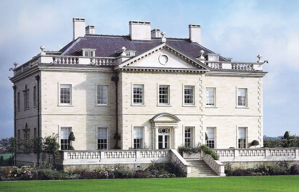
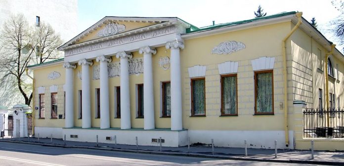
The most common type of house of strict classicism is a prismatic compact volume with a central hall and rooms bypassing it around the perimeter. Galleries were attached to the main volume — symmetrically arranged, connecting the main volume with the side wings.
The interiors were “strung” on a single axis: the lobby is the main entrance hall, completed with a dome, and the galleries were located across the main longitudinal axis of the building. The main structural elements of the internal volume of the building – the hall, the grand staircase, the lobby, the main entrance – shifted from the central transverse axis of the palace, but the main facade, as a rule, was symmetrical.
In addition, the symmetry of the internal space of the building, the identity of the layout of both floors was violated. The grand staircase was arranged not in the vestibule, but in a separate volume of the end risalite. The main entrance and the canopy were also removed from the main facade. There was no symmetry in the arrangement of the front rooms in relation to the main axis of the building, this gave comfort and originality to the interior appearance of the house. Along the main facade there was a reception room, a main hall, a dining room, and a pantry. Most houses were characterized by the reception of a centrally located entrance to the suite of living rooms with its opening in both directions. The connecting link between the staircase and the front rooms was a small entrance hall.
The rooms were arranged in two rows, parallel to the main and rear facades.
The front rooms faced the main facade. The state rooms were grouped around the main hall. All the rooms were rectangular in shape. The suite of rooms did not turn onto the garden facade, but closed in such a way that it was necessary to go through all the rooms again. The hall was enlarged and shifted from the axis of symmetry of the palace.
Rectangular front rooms were replaced by oval, round, faceted and others. The houses were characterized by a two-time review of the front rooms (they went back and forth), multiple visits to the hall, a decrease in the artistic expressiveness of the rooms adjacent to the hall, and an increase in those removed from it. Be sure to combine two adjacent rooms. The doors of the suite were united. In each subsequent interior there had to be something new, surprising.
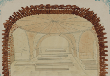
Significant interiors are distinguished by rich architectural components — stoves, fireplaces, mirrors, arches, vaults, niches, exedra, conches, as well as pilasters and columns were used especially often. The rooms on the first floor consisted of two or three living rooms, a sofa room, a boudoir, a front bedroom, and a hall. Next: dining room, house church (in the side facade), gallery. They closed the ends of the suite, had columns and light penetrating through them,
Color scheme of the walls
The walls were no longer decorated with carvings, now, according to the requirements of classicism, they were treated with strict closed planes, decorated with pilasters or columns, covered with framed damask or other fabrics. Woven draperies were gradually replaced with smooth plaster and paper wallpaper. There were unusual colors, shades in which the walls were painted — the color of the morning dawn, pearl (pearl), lingonberry, greenish and others. In the second half of the XVIII century . wooden joinery panels, plaster panels and panels made of multicolored artificial marble were used for wall decoration. By the end of the XVIII century. painting panels became widespread. Murals “under marble” were especially fashionable.
Usually the color was chosen darker from the one present in the decoration of this room. The color of the frame of the panels was darker than the panel itself. The murals on the walls had the following subjects: landscapes with architecture, lush Italian nature, rural or park views. An elegant decorative molding was placed on a delicate background. Cornices were a sign of luxury. In this era, order cornices with a full entablature appeared.
The sculpture was used in the form of rectangular bas-reliefs such as panels or medallions. Basically, smooth clean calm surfaces of the walls were used in combination with antique ornaments and details. The ceilings were wooden beams, or in the form of trusses with a hemmed ceiling. The ceilings imitated a vault or a dome. The painting of the ceiling lights was mainly ornamented. Arabesques were used to cover the panels of doors, pilasters of O-shaped blades on the walls. Painting was used in the surfaces of plafonds between architectural elements. Small pictures in closed frames were placed in the center of the ceiling, the rest of the field was filled with ornaments. The ornamentation was based on antique motifs, order details with the inclusion of triumphal details — military fittings, laurel wreaths, garlands, palmettes, figures. Along with polychrome painting, the monochrome technique “grisaille” — imitation of sculptural reliefs and architectural cuts – has become widespread.
