The conventional understanding of pointlessness is that we combine various basic lines, planes, surfaces and volumes with each other, regardless of what these parts are.” “The broad possibilities presented to us when using non-objective constructions should be applied at least for one reason, that as a result they can create for us a fully developed worker of the creator, a composer of new forms. Thanks to the use of non-objective constructions, we will not constrain our student with any inhibitory principles during tasks and will free him from conservative and outdated methods, while giving full scope to his imagination.”
Konstantin Melnikov, however, believed that “looking for architecture in the deserts of graphics is sophistry.” However, it must be admitted that it was the mastery of graphic variations that led Y. Chernikhov to discover new plastic and constructive rhythms. If Chernikhov sees the advantage of ornamental exercises in the fact that they develop imagination, imagination, those creative qualities that attach architecture to art, then the modern French architect and mathematician J. Zeitoun interprets ornamental constructions in themselves somewhat differently: as a method of ordering architectural design. The design image appears as a sign system that can be interpreted. He showed that the regular lattice plays the role of a supporting structure and its expanded understanding is associated with the idea of an “architectonic complex”.
Zh. Zeitoun offers two aspects of lattice theory: rules and procedures for working design and general morphology problems in architecture. The first aspect is associated with regulation, production standards, typing, with the peculiar aesthetics of the sample and template inherent in these concepts; the second concerns issues of graphical representation on the plane of real objects or design ideas about them.
The possibilities of graphics are quite limited: these are sketches, drawings, line sketches, perspectives, tinted plans, axonometry, etc. Not always a complex topological or functional scheme can be represented in a graph. We have to resort to simplifications and, consequently, to finding a compromise between intentions and implementation. This indicates that the restriction affects the creative process in different ways. Firstly, the limitations of the image itself, and secondly, the limitations associated with certain types of behavior and sign systems due to the general cultural context of architectural activity.
In architecture, a flat grid (design grid) is sometimes contrasted with free design. However, free composition does not mean that there are no rules at all. It is not enough to divide the plan into squares to talk about the use of the lattice principle in design, and by itself the rejection of flat lattices does not lead to freedom of search. If a flat lattice is considered as a measure of the orderliness of the plan, then it is consistent with both methods of design.
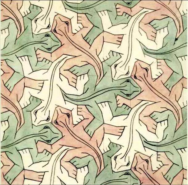
Ornamental symmetry is not only a kaleidoscope of geometric transformations, but also the basis of the normative approach in creativity as a special grid, a canvas of recommendations and restrictions, program conditions narrowing the choice of variant, search solutions.
On the pages of the article “Finally an integral ornament!” Frank Lloyd Wright defines an integral ornament as “a developed sense of building a building as a whole or revealing the abstract logic of the structure as such.” This means that the integral ornament is in general a visual articulation of the structure itself, just as it appears in the structure of a tree or a wildflower.
By giving examples of appeals to ornamental symmetrical figures so different in meaning, we tried to show the conventionality of symmetrical connections in creative search: from intuitive reproductions of geometric archetypes to programmatically introduced grids of normative design. Both rational, orderly, and impulsive creativity, despite their habitual contrasting understanding, have vanishing points that symmetry helps to detect.
Perhaps there is some pattern in the fact that symmetry in its classical variations marks turning points in the history of architecture. Let us recall the dynamics of rotation of the pavilion plan for the Paris exhibition of 1925 by Konstantin Melnikov. The pavilion became an event in the architectural life of the century, similar to the construction of the Church of Sant’ Ivo in Rome by architect Francesco Borromini, where the opening of the inner space into infinity, achieved by the dynamics of the symmetry of the spiral of the dome light lantern, made a revolution in the compositional thinking of the XVII century. Three centuries later, the Italian art critic Bruno Dzevi dedicates excited lines to this structure: The saga of the domes reached its final stage when the huge church of Sant’ Ivo della Sapienza was built in Rome.
The line of its heel is one with the cornice of the lower room; therefore, the dome, increasing the height of the building, at the same time plunges its “roots” into it. It represents a total re-integration, as is the case in the Pantheon, however, this is an anticlassical re-integration that breaks up the regular space. And indeed, the geometric matrix of Sant Ivo is unrecognizable. The hexagon of the floor does not have a special effect on the space, since its sides are cast in convex and concave shapes. Centrifugal forces are not only interspersed with centripetal impulses, but also encounter obstacles on their way out. Triangles in the shape of the star of David do not quite fit into the plan, however, they indicate hypothetical geometric schemes that, passing through the fence of the church, end only outside the fence. Borromini’s genius made this miracle possible by saturating the central organism with exciting dynamism.”
