Most people are familiar with the term “high-tech,” a combination of words that is used widely to describe the type of design that uses advanced technology and that puts this technology firmly on display. Since the 1970s there have also been “high-tech” buildings— structures that wear their technology on their sleeves in a variety of ways, dramatically provoking the shock of the new.
High-tech (or, sometimes, hi-tech) architecture is closely associated with a number of architects who emerged, mostly in Britain, in the 1970s. These architects qualified at a time when the modernist ethos was still very strong and functionalism was seen as the key to good design.
Unorthodox influences
This was the architectural orthodoxy of the time. But the young architects of the 1970s were also captivated by a number of unorthodox approaches—for example, the innovative “Dymaxion” theories of Richard Buckminster Fuller (see Dymaxion design), with his prefabricated metal houses and geodesic domes, and the revolutionary ideas of the Archigram group (see Archigram), with their plug-in modules and walking cities.
So prefabrication, the use of ready-made components, and the outward display of technology became key to these architects, who included Richard Rogers, Renzo Piano, Norman Foster, Nicholas Grimshaw and Michael Hopkins. The building that set the tone was the Pompidou Center in Paris, designed by Richard Rogers and Renzo Piano, a building that famously displays all its services (escalators, ducts and pipes) on the outside, leaving the interior for large, open-gallery spaces. The result is a colorful riot of a structure.
Signature buildings
But subsequent high-tech buildings took a slightly different approach, especially in the work of Rogers and Norman Foster. Their signature buildings were Foster’s Hong Kong and Shanghai Bank in Hong Kong and Rogers’ London Lloyds Building. Both display structure and services such as elevators in an open, high-tech way. But they add something else—both buildings look as if they are made of beautifully machined, factory-made components, with everything immaculately finished. These structures look like finely honed machines.
The Lloyds Building has a gleaming metallic finish and services such as lifts are hung on the outside of the building. The Hong Kong and Shanghai Bank displays its structure to the world in the form of components such as vast trusses that were made in Britain and shipped out to Hong Kong. Features such as bathroom pods (recalling Buckminster Fuller’s prefabricated Dymaxion bathrooms) were manufactured off-site and delivered complete and fully fitted out. All the finishes are smooth and machine-like.
The Hong Kong and Shanghai Bank looks so much like a machine made of bolted- together metal parts that there was even a rumor that the structure could be taken apart and moved if the bank fell foul of China’s government when control of Hong Kong passed from Britain to China.
“The artist no less than the scientist or the philosopher … works in a structured area of problems”
Ernst Kris, Psychoanalytic Explorations in Art
High-tech as a style
The beautifully finished appearance of the Lloyds Building and the Hong Kong and Shanghai Bank seemed to embody the old ideal of functionalism, with everything precisely engineered to provide users with the large, uncluttered office spaces and big central atria that they required. But actually the designs were more finely honed than they needed to be. The engineered machine aesthetic was in part an end in itself, a way of creating a high-tech image.
As a style, high-tech won Foster, Rogers and their colleagues many followers. The boom years of the 1980s saw many tall, shiny office towers that, in part at least, imitated their style without delivering such high quality. The term high-tech became popular as a way of describing everything from metal furniture to the design of science-fiction movies.
The atrium
Conventional skyscrapers consisted of largely similar, uniform-height floors of offices. Many clients in the late 20th century, however, wanted atria—big, high interior spaces. Atria act as meeting places, as access areas leading visitors to elevators and office floors and as awesome spaces to impress clients. The strong “inside-out” structures in both the Lloyds and Hong Kong and Shanghai Bank buildings enabled their architects to create impressive multiple-height spaces in this way.
New directions
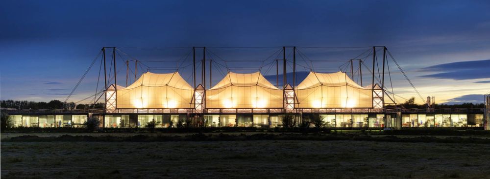
Meanwhile, however, the most innovative high-tech architects had moved on. Nicholas Grimshaw and Michael Hopkins, for example, produced a wide range of innovative buildings, some of which took structures in new directions—for example, developing tent-like suspended structures that could cover a large area with lightweight materials.
Foster and others took technology in other directions, using computer design and modern materials to design buildings that were increasingly sensitive to environmental concerns. They showed that high-tech and green architecture could come together, and that an ecologically sound building did not have to be constructed of “traditional” materials, such as wood and mud.
Tension structures
Tent-like structures, which were roofed with strong fabric suspended from cables attached to masts, were an innovative feature of high-tech architecture. Making use of modern fabrics coated with strengthening and weather-proofing materials, such as Teflon, they were sometimes justified because their lightness allowed buildings to be erected where the subsoil was too weak to support a conventional building. More often, however, the biggest benefit was in the dramatic appearance—the large, faceted shapes of Michael Hopkins’s Schlumberger Research Centre, Cambridge (below), is a good example.

For the next generation of architects, high-tech was an interesting episode that could be inspiring. It encouraged designers to think differently about materials, about ways of constructing buildings, and about prefabrication. Its influence lives on in the work of many—architects who do not want to imitate the “machined” appearance of the Hong Kong and Shanghai Bank but who can respond with new experiments in design and structure.